
There are plenty of workflows within the Advanse system that have needed revamps over the years. Take a look at some of the projects below!
New Banner Collection Page
In order to create multiple ads from a single template, a user must encounter the “New Banner Collection” page. This is where they connect data to creative to create the kinds of ads the need. It’s a tricky concept, so my team and I wanted to tackle a redesign. The goal was to make a complicated process simple and easy-to-use.
Design Principles
This method allowed us to decide upon rules to carry throughout the redesign.
Task Analysis
A task analysis really helped us understand what users needed to accomplish the main goal. This method was particularly helpful in understanding what prior knowledge was needed in order to use this specific page, and what the system will need to do behind the scenes.
Personas
Personas helped us narrow down what kind of users would be using this particular page/workflow.
Rapid Sketches
My team and I sketched out a bunch of rapid sketches. We voted on our favorites, sketched a little more from there, and continued to do so until we were happy with the direction.
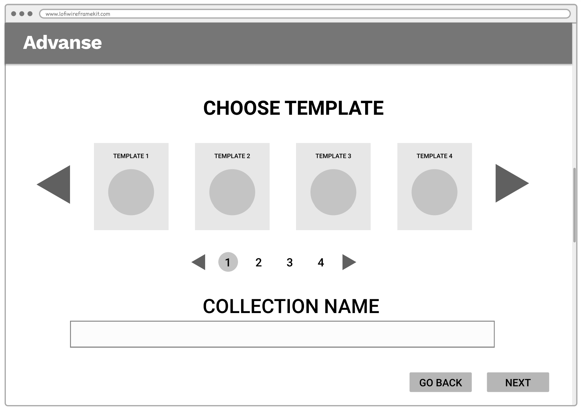
Low-Fidelity Wireframe
Based off our findings and sketches, my team constructed a low-fidelity wireframe to discuss in our weekly UI/UX meeting.
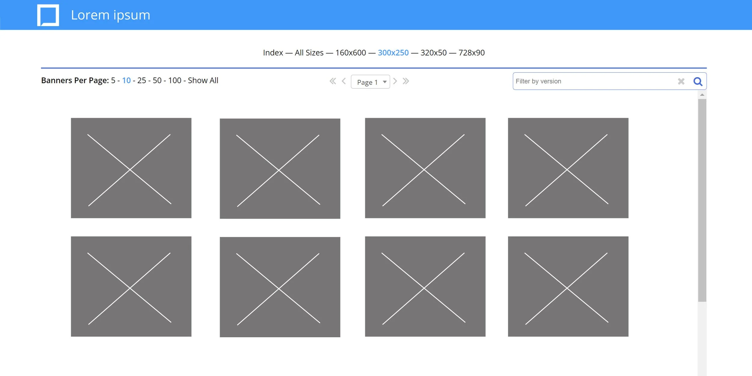
Ad Preview Page
Old Preview Page
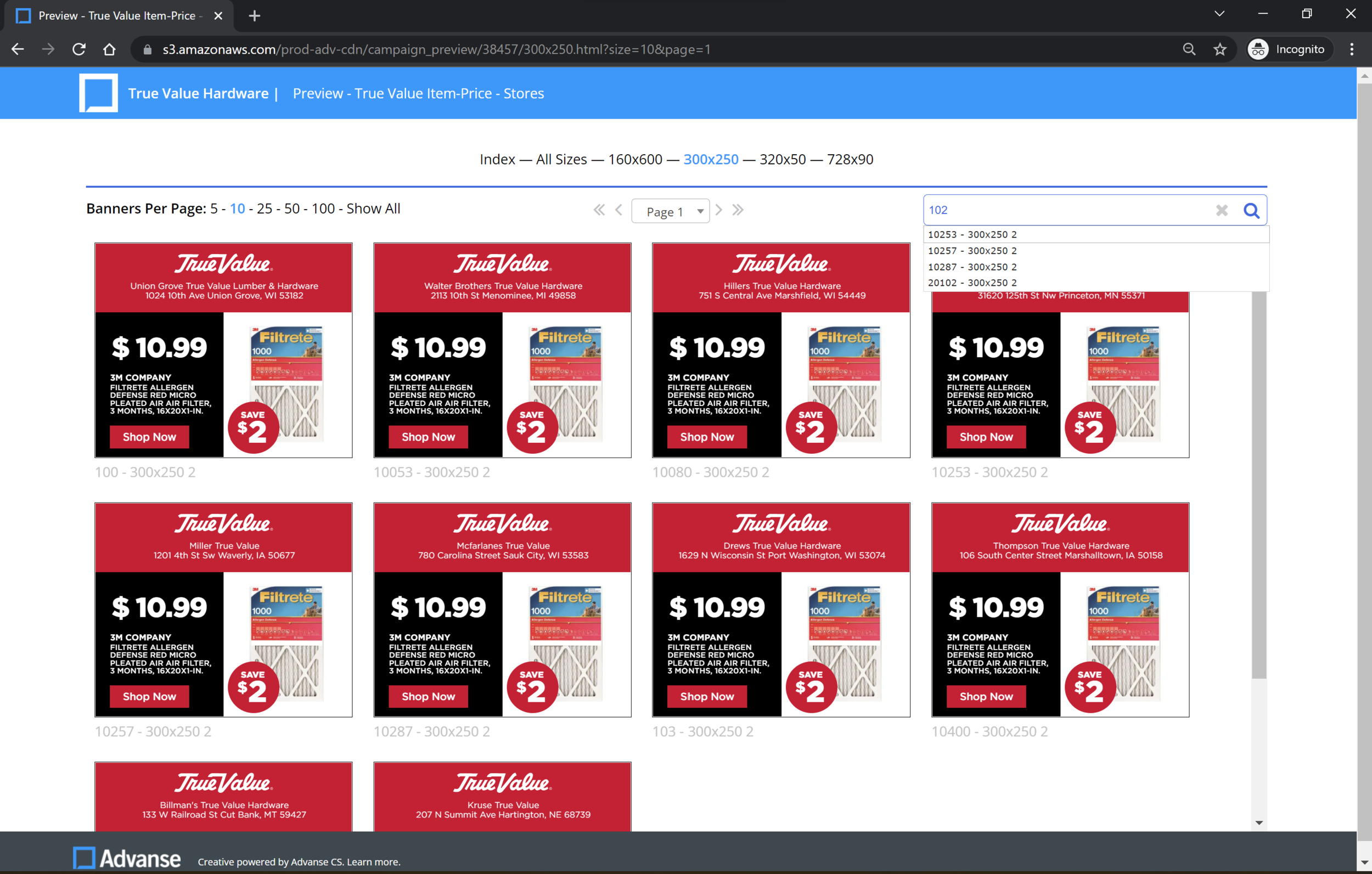
New Preview Page
We also revamped our ad preview pages! New an improved with type-ahead searches, ability for users to control how many banners appear on a page, and improved navigation.
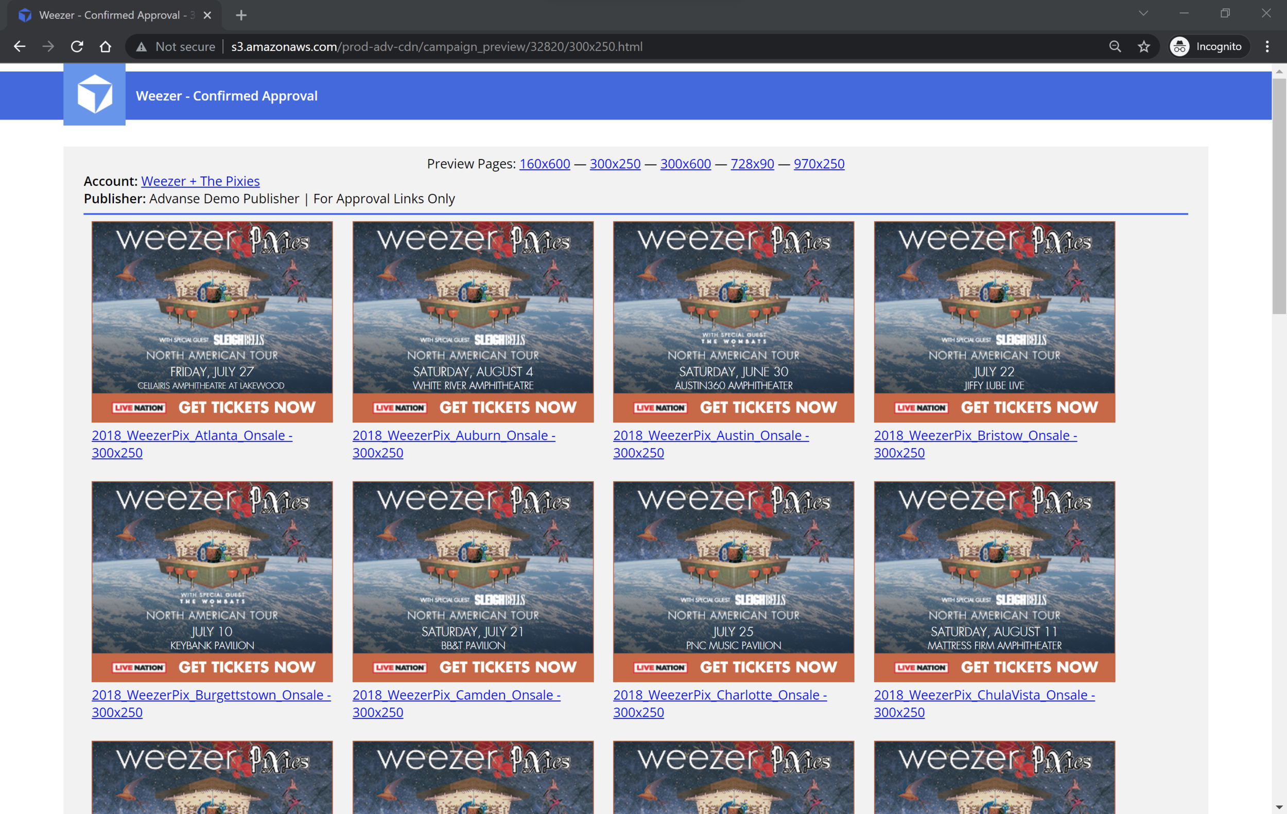
You can find a live ad preview page here…
...as well as a direct link to the second image above…
…and lastly, a small annotated mock for devs.