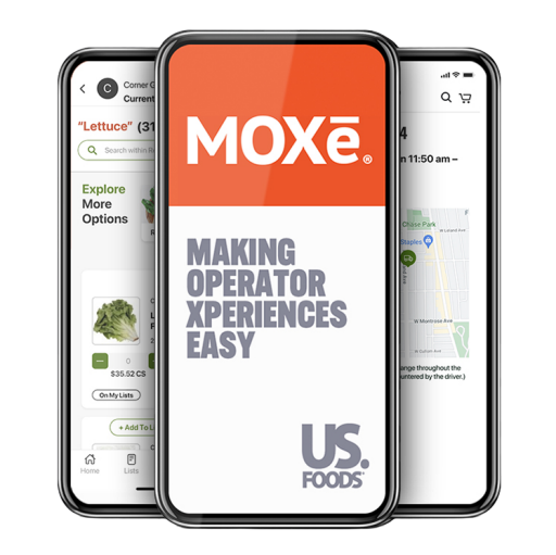
US Foods’ MOXē
I guided the UX/UI design for MOXē, a comprehensive foodservice business app that goes beyond placing US Foods orders. I focused on creating an intuitive experience that lets restaurants manage every aspect of their operation 24/7 from the palm of their hand.
Feature
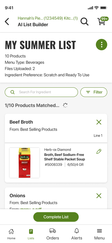
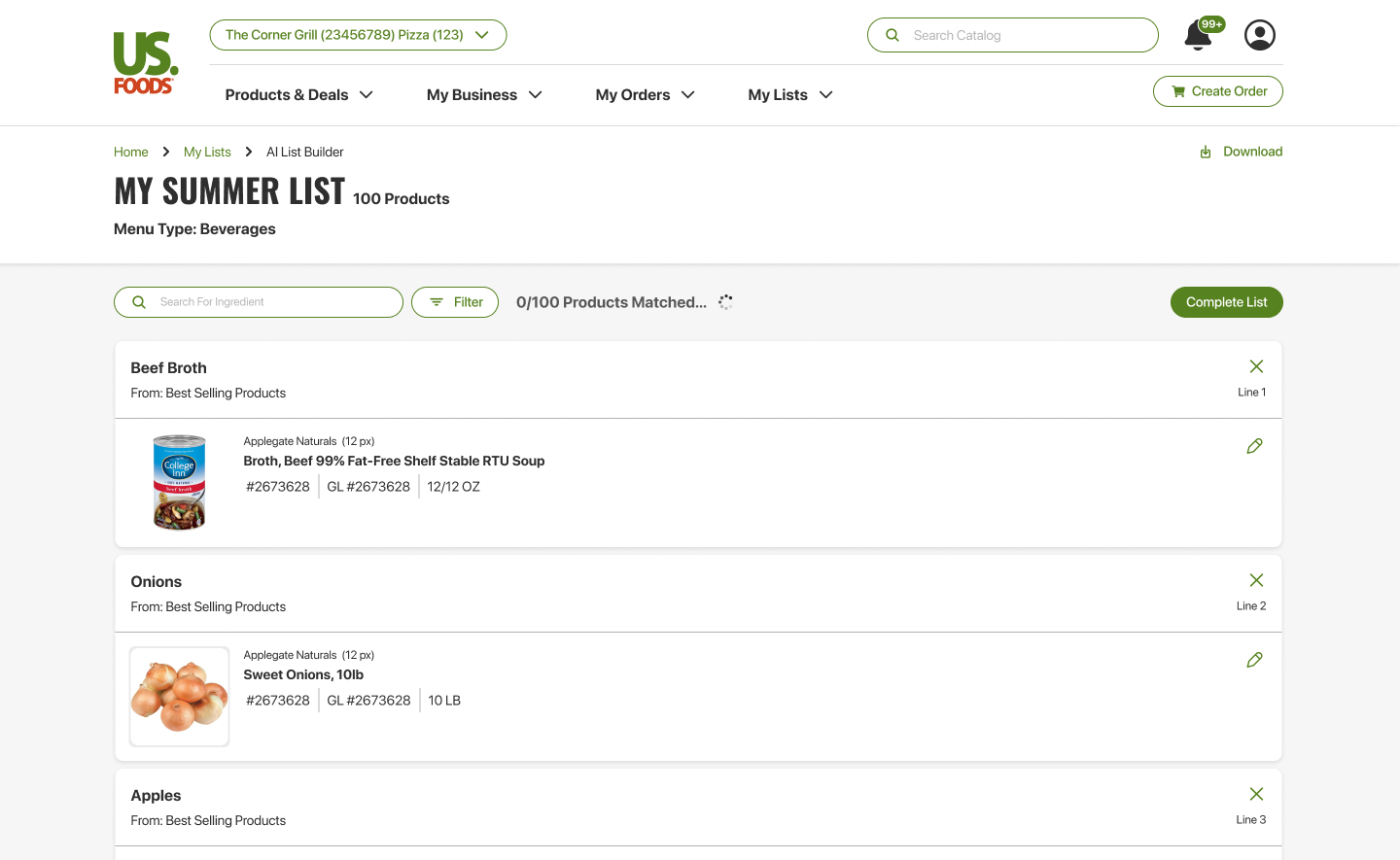
AI Shopping List Builder
We created an AI-powered list builder for MOXē that makes turning photos into shopping lists effortless. Simply snap or upload a picture — whether it’s a handwritten note or a back-of-house inventory photo — and the AI automatically recognizes items and organizes them into a clear, ready-to-use shopping list. The result: less typing, fewer mistakes, and a faster path from image to action.
Crafted for: Sales Reps (initial launch), Restaurant Owners & Restaurant Staff (post launch)
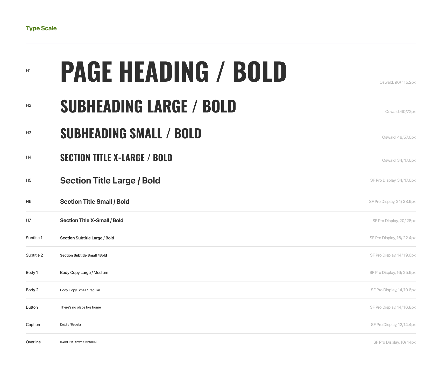
Design System
MOXe’s design system was a living document, evolving to meet and exceed accessibility standards. It became a scalable, clear, and consistent foundation for US Foods’ current digital design library.
Feature
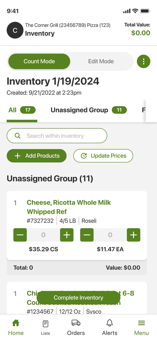
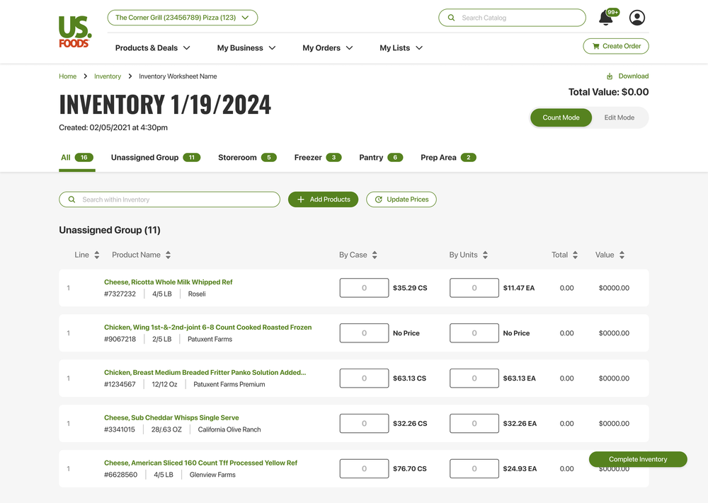
Inventory
Crafted for: Restaurant Owners & Restaurant Staff
MOXē Inventory is a flexible inventory-management feature that lets users build an Inventory Worksheet in several ways to match different workflows. Options include creating from an existing Shopping List (Custom List, US Foods Order Guide, or Master List), pulling items from Past Purchases (last 30, 60, or 90 days), duplicating a previous inventory, or starting from scratch with manual entry.
Feature
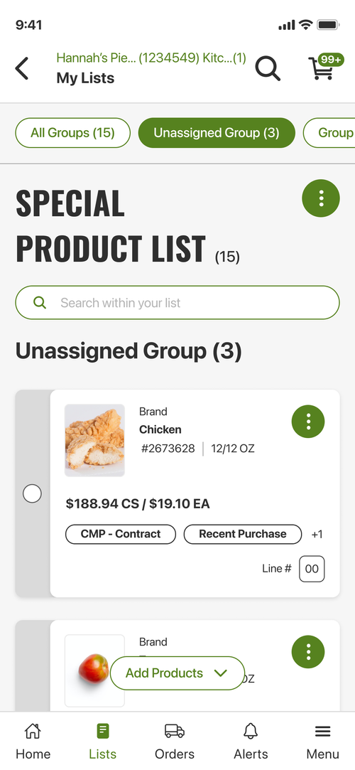
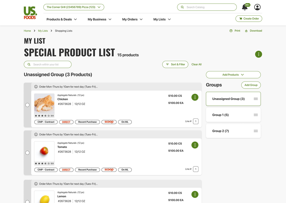
Shopping Lists
Crafted for: Sales Reps, Restaurant Owners & Restaurant Staff
The Shopping List feature in MOXē streamlines the ordering process by consolidating regularly purchased items into a single, easy-to-manage location, helping users save time, reduce repetition, and maintain consistent inventory.
Who did we design for?
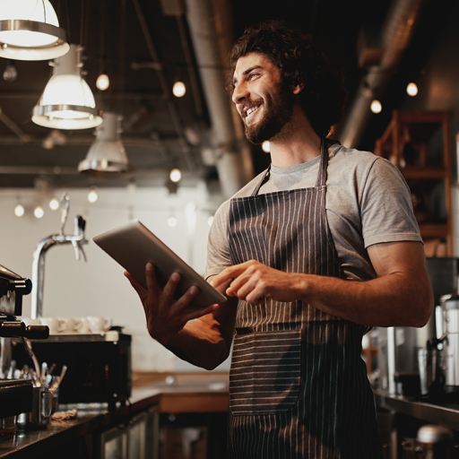
Restaurant Owners
Restaurant owners are short on time. They handle operations, staff, inventory, and service, so they need quick, useful tools—ready-to-use reports, real-time alerts, and simple ordering and inventory processes. We built MOXē mobile-first, with easy onboarding, strong security, responsive support, and simple customization for different kitchens.
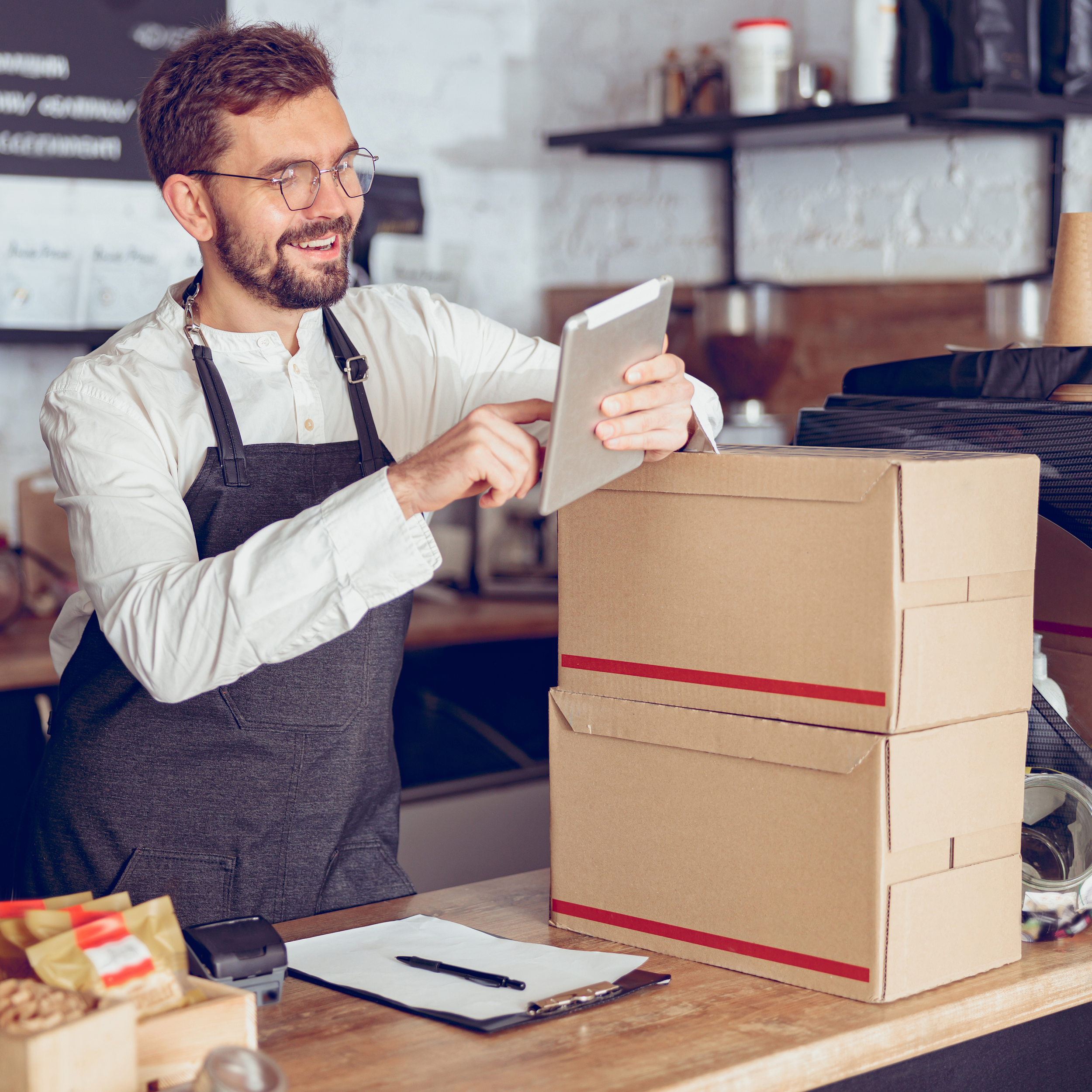
Sales Reps
US Foods needed a faster, cheaper way to replace multiple in-house apps. We delivered an AI list builder, sales dashboards with actionable customer insights, and a sales-focused UI. Sellers saved time with less data entry and training, offline field access, strong CRM and inventory integrations, and configurable reports for territory planning and quota tracking.
Restaurant Staff
Staff, like restaurant owners, are short on time and need fast, practical tools: quick opening/closing checklists, ready-to-run shift task lists, live ticket/prep status, and simple inventory pull sheets. One-touch actions, minimal training, offline reliability, clear priority visuals, dependable support, and easy role-based settings were essential.
Behind the Scenes

Chatting with “Whom”
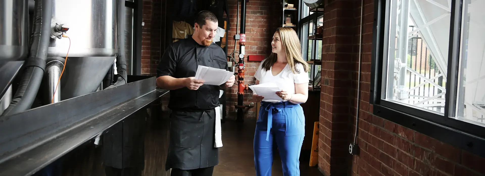
As part of our process, we joined rides with sales representatives to gather firsthand feedback, visit customers, and document their specific needs for MOXē. We also engaged with colleagues across multiple departments—especially those in customer-facing roles—to capture diverse perspectives.
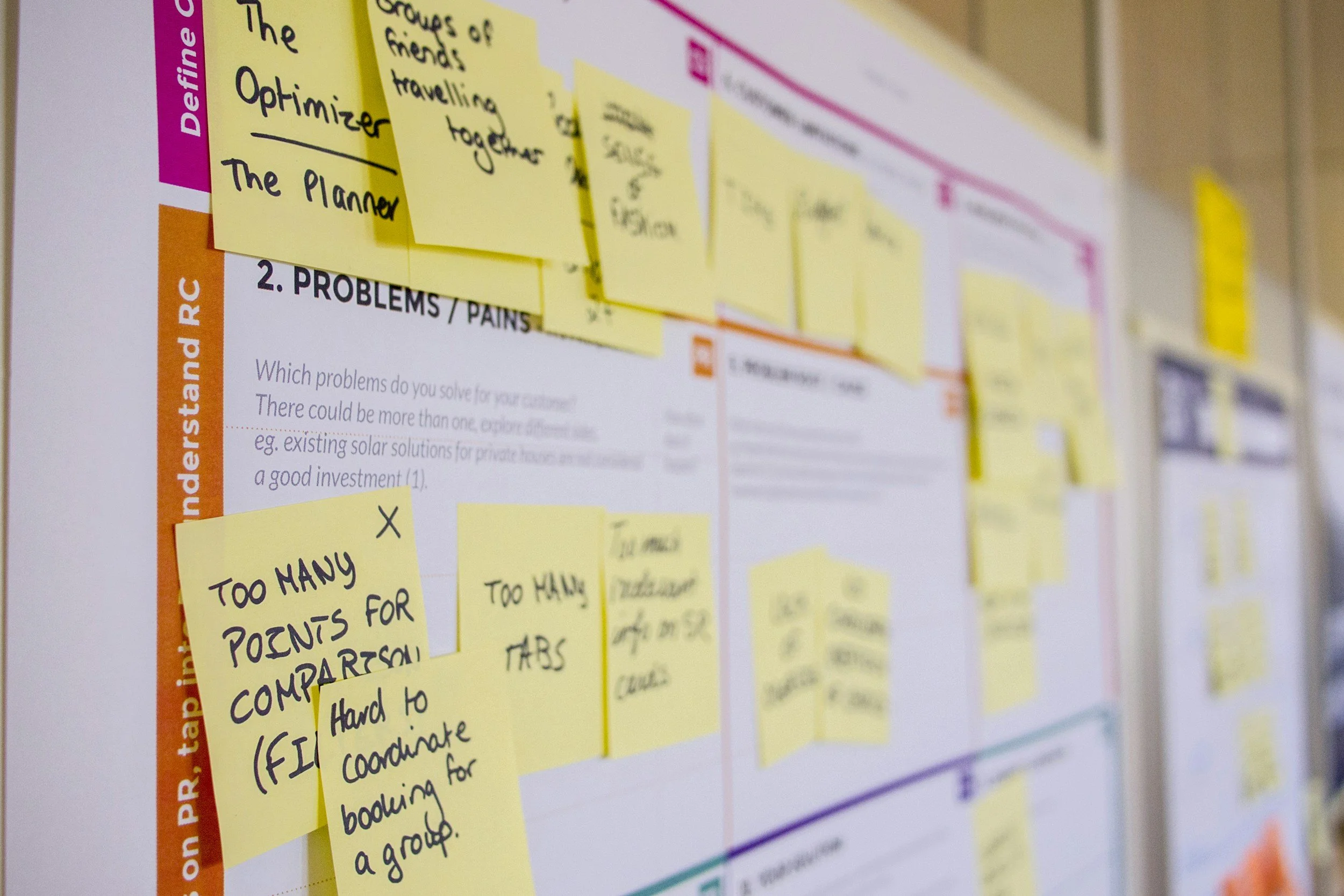
Intentional Research
With the 18F methods as our guiding principle, we implemented research approaches across the board to arrive at accessible, user-focused decisions within MOXē, including but not limited to journey mapping, comparative analyses, content audits, site mapping, and task-flow analysis.
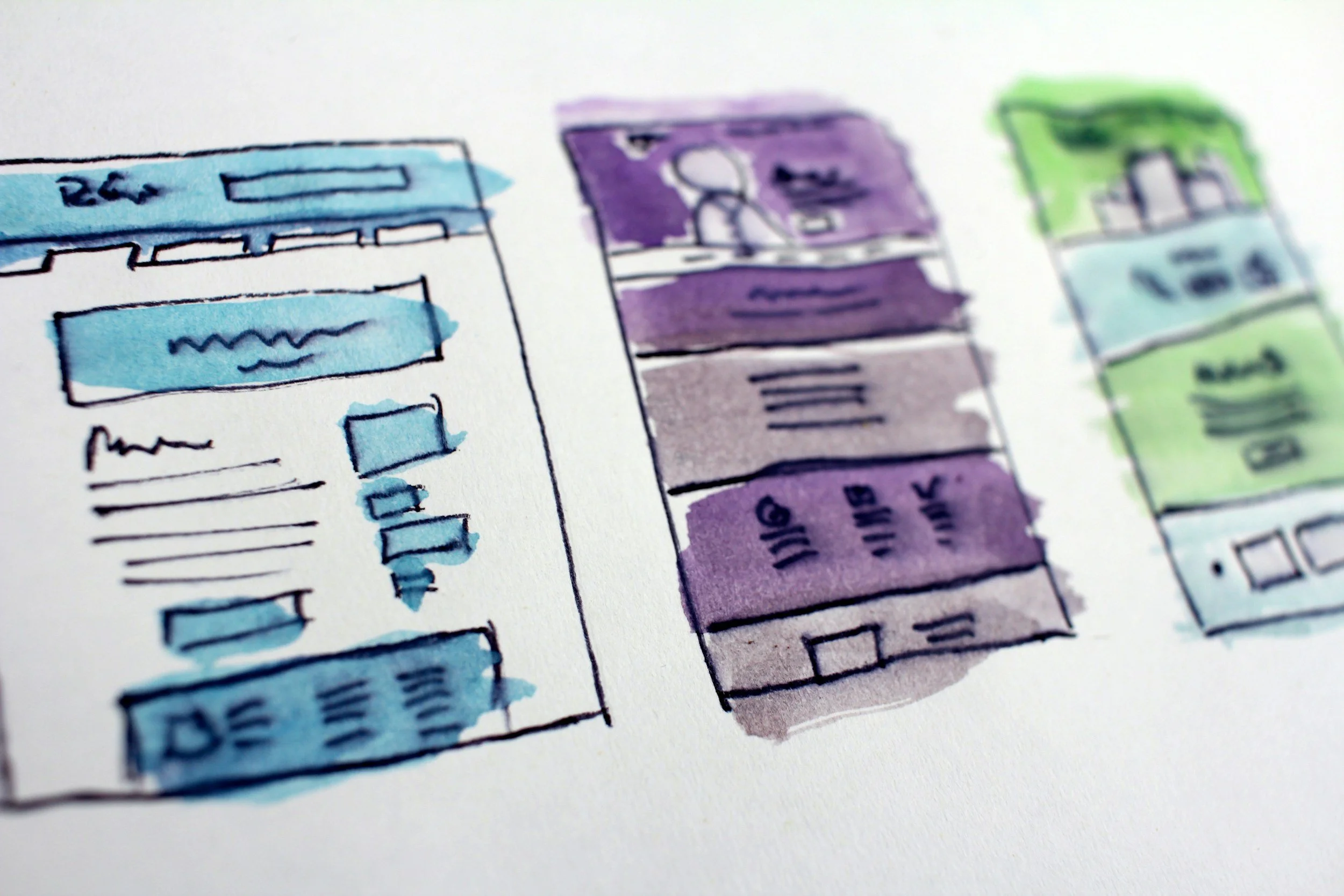
Wireframes
Before developing pixel-perfect UI in Figma, we created quick wireframe sketches and reviewed them in internal design meetings. This enabled fast, focused decision-making and let us validate key interactions and layout choices without wasting time on detailed mockups.
MOXē Moving Forward
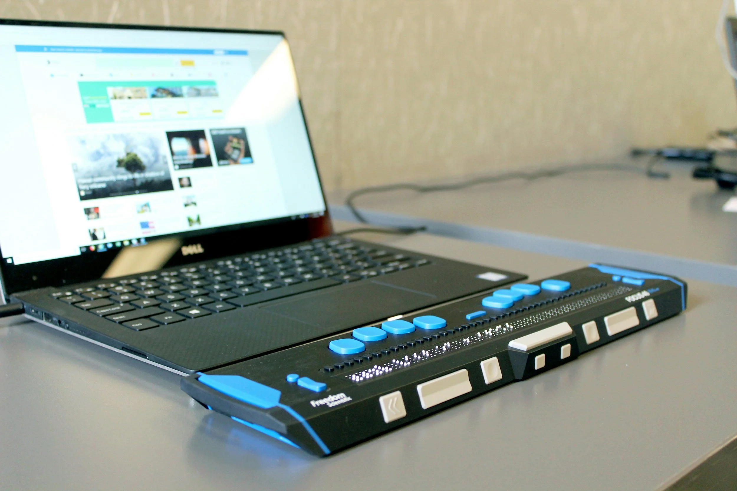
Commitment to Accessibility
MOXē was developed over five years, which introduced inconsistencies across some user flows. Early design decisions did not fully meet accessibility best practices. As the project progressed, we prioritized revisiting legacy flows and addressing accessibility gaps to create a more consistent, inclusive experience.
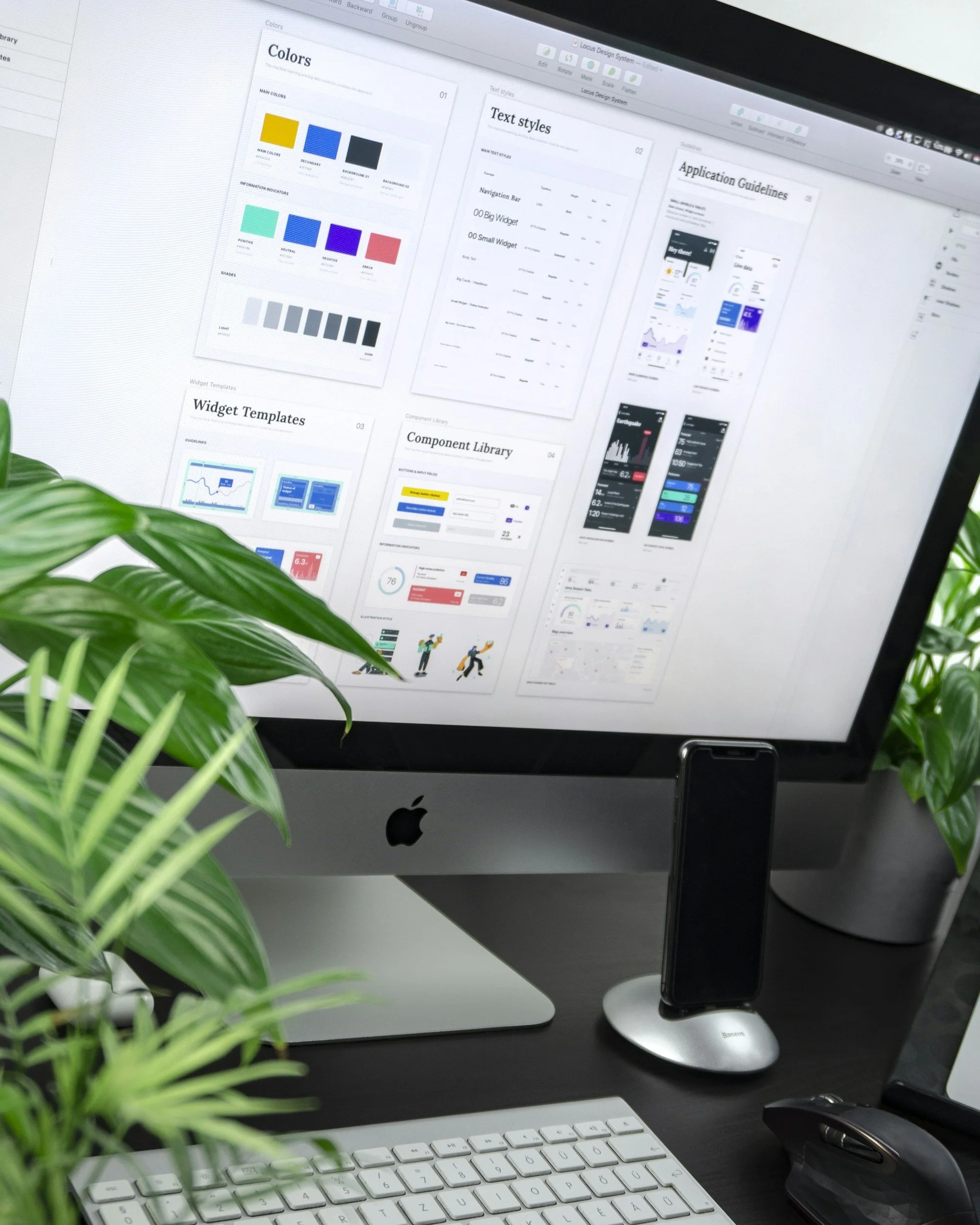
US Foods Digital Design System
As part of our commitment to UI consistency, accessibility, and design best practices, we conducted a company-wide overhaul of US Foods’ digital design system. The work is ongoing — view the in-progress documentation below.
Dedication to our Users
The most important part of designing MOXē was regularly engaging our users. Sales reps, restaurant owners and staff, and team members across the company informed every design decision. As we iterated on the application, their feedback guided each improvement.